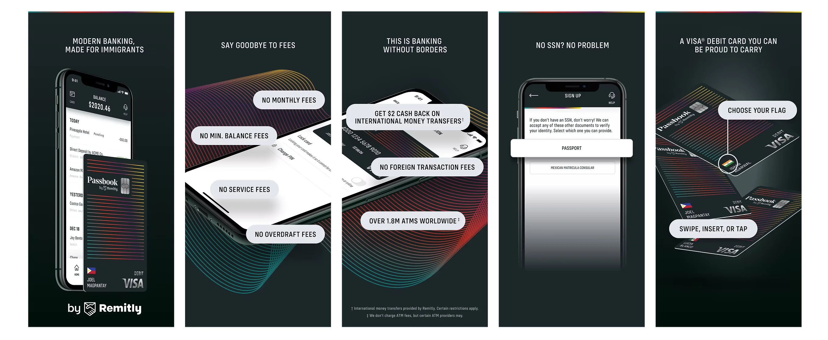
An AI-assisted, tri-modal banking app — conversational chat, voice, and touch — built for immigrants navigating English-language and literacy barriers. Recognized in Time Magazine's 100 Best Inventions of 2020.
Details here are my own account of the work, obfuscated to comply with my non-disclosure agreement, and don't necessarily reflect the views of Remitly.
Overview
There are over 44 million first-generation adult immigrants in the U.S. — more than 1 in every 6 workers — earning over $1.3 trillion in wages annually. Until 2020, no financial services company had built a comprehensive banking product for them. Built by Remitly, the largest independent digital remittance company in North America, Passbook set out to remove the fees, barriers, and complexity standing between immigrants and a real bank account.
I led the design of Passbook across iOS and Android from the project's outset in September 2019 through launch in January 2020, and continued leading efforts to evolve the product around immigrant pain points.
The challenge
“Modern banking, made for immigrants.” The positioning line the product had to earn — and the reason the sign-up flow, not the feature set, was the real design problem.
Roughly 1.7 billion people globally remain unbanked. Many U.S. immigrants lack the Social Security numbers and domestic ID documents that banks typically require — not because it's a legal requirement, but because it's how banks manage risk. Passbook's mission: build the most loved, trusted, easy-to-use banking experience for immigrants, full stop.
The first sketch. Everything that mattered was already on it — no SSN, no fees, Spanish, and “personality”. The last one is the easiest to cut and the reason the product felt like it was built for someone.The promise, stated in three lines on the first screen. “No SSN? No problem” is deliberately second — after speed, before money — because it is the objection that stops people applying, and it should be answered before they have to raise it.
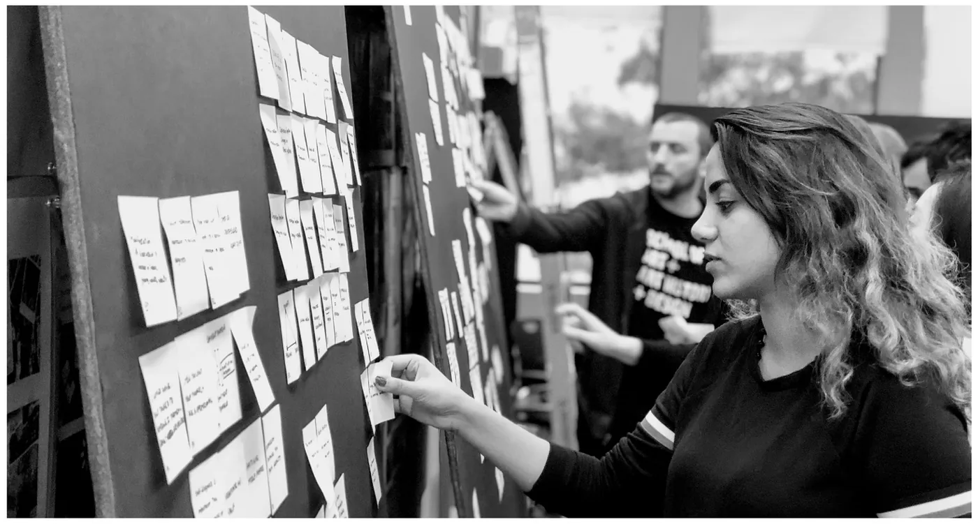
I partnered with senior PM Crystal Yan to run customer and market research, interviewing and running participatory design workshops with 50+ international students and immigrants — work that grew into the ongoing Passbook Research Pool, now 500+ customers strong.
Participatory design workshops with international students and immigrants — the origin of the 500-person Passbook Research Pool.
Research session · 5:47One of the participatory sessions behind the four principles below.
The competitive scan mattered here. Chime, N26, Varo, Revolut, Dave and Moven were all doing app-first banking well — genuinely good products, none of which I'd fault on interface. But every one of them was built for someone who has a Social Security number and a utility bill in their own name. The gap wasn't the experience. It was who the onboarding assumed you were.
The competitive set. Scanning them settled the strategy quickly: competing on features was pointless, because the market was already good at features. Competing on eligibility was open.
Eliminate barriers
Digital verification with immigrant-friendly ID — no Social Security number required to sign up.
No borders
An account and card usable globally, with full self-service — no calling customer support.
Secure & trusted
For customers new to Remitly, trust was the single biggest barrier to switching banks.
Personal
A product that recognizes and honors the immigrant journey, not just a generic bank app.
Those four findings became three principles the team held the work to — and the one that decided the most arguments was Welcomed: the stance that we assume good intent, the opposite of how risk teams are trained to read a customer without standard documents.
Welcomed, Confident, Enabled — the principles, and the customers they were written for.
Approach
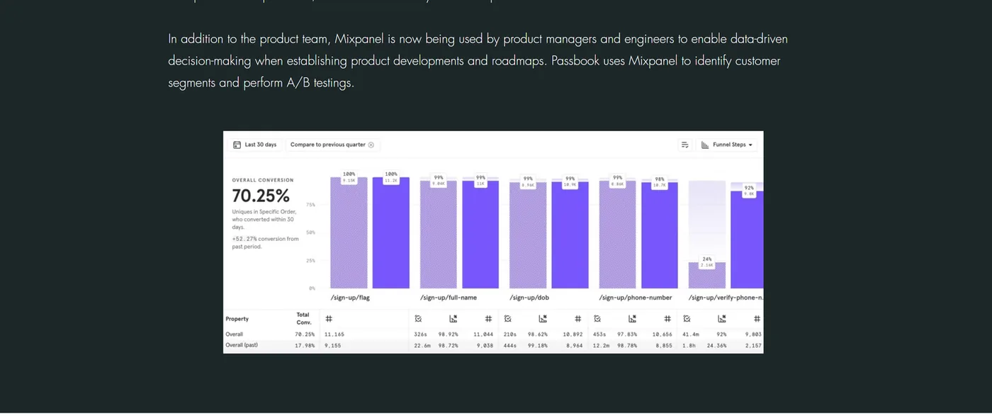
Onboarding accepts an ITIN, passport, or foreign government IDs like the Matrícula Consular — identification immigrants actually have. I built Passbook's design system, frameworks, and prototypes to align the team on vision and content strategy, and stood up product analytics via Mixpanel so PMs and engineers could make data-driven calls and run A/B tests.
The screen the whole product argument rests on. Not having an SSN is offered as a third equal option, not an error state — with the honest cost stated up front (“review may take up to 2 days”) rather than discovered later.
When Mixpanel surfaced a 28% drop-off at the proof-of-address step, I ran 10 follow-up interviews, traced it to a lack of acceptable documents for immigrants, and partnered with compliance officer Kellen Ball on a mailed postcard verification path — directly lifting activation.
The fix for the 28% drop-off. Rather than demanding a document immigrants often don't have, the flow offers a postcard mailed to the address itself — verification by delivery.
Operation Proof of Address · 1:27The internal demo of the postcard path, built with compliance.
Bilingual from launch, not a later localisation pass. The card illustration is the detail I'd point at: three cards, three flags, three names — Laura Cecilia, Juan dela Cruz, Niv Patel. The product shows you people like you before it asks you for anything.The same flow in wireframe. Working greyscale first kept the arguments about sequence and disclosure — how much to ask, and when — rather than about visual treatment.The finalized sign-up, end to end. Expand it and read the order: identity comes last. Everything cheap and pleasant — verify a phone, pick your flag, name your card — happens first, so by the time the hardest question arrives you have already built something of your own. The final screen is where “I don't have SSN or ITIN” sits as an equal third option.
The 5-day, data-driven design process I built — research strategy, research pool, design-system manager, and Mixpanel analytics — let the team ship up to 4 features per week. I also integrated the Lottie animation library and micro-interaction design, lifting customer satisfaction 12%, and built React Native UI components directly alongside engineers.
The onboarding journey map the funnel work came from. Expand it — the row that matters is proof of address, where the map already predicted the drop-off that Mixpanel later measured at 28%.
My role here was insisting the drop had a cause worth naming. The step wasn't broken — it was working exactly as designed, for a customer who didn't exist. I stood up the analytics that made the loss visible, ran the ten interviews that explained it, and then took a compliance constraint rather than a design constraint to the person who could actually move it.
Onboarding funnel — the proof-of-address dead end
toggle the fix
The Mixpanel funnel I stood up — the instrumentation that surfaced the proof-of-address drop-off in the first place.
Persona
Getting Ahead Gloria
Stable income, direct deposit into a primary account
Goal: making more, not just getting by
Pays via debit/credit or Apple/Google Pay
Persona
Getting By Gabriel
Unstable income, gig-economy, paycheck to paycheck
Goal: saving, staying out of the red
May not qualify for or know how to get a credit card
"Sending money was already easy with Remitly and now you guys have taken this to another level!"
Vaibhav, international student from India
The thing itself
Thirteen seconds of the shipped app — onboarding through to the card.
Shipped app · 0:13No audio — loops.
Watch the second screen
“Designed for you, by Remitly.” Three photographs of actual customers before a single feature is mentioned. For someone who has been turned away by a bank, recognition has to come before the value proposition — otherwise the value proposition is addressed to somebody else.
And the pacing
Seven onboarding cards with Skip always visible. Nothing is gated behind reading, because the customers most likely to need the explanation are also the most likely to find English on a screen tiring.
Chat, voice, touch — the same assistant
Tri-modal wasn't a feature list — it was an accessibility position. A customer who speaks English confidently but reads it haltingly is failed by a screen-only bank; one sharing a noisy apartment is failed by a voice-only one. Same task, three routes in.
Passbook Assistant · 0:19No audio — loops.
The line that does the work
The assistant opens with “Para español, escriba ‘Spanish’ o ‘Español’” — the offer of Spanish arrives in Spanish, before anyone has to admit they need it. A language selector buried in settings asks a customer to declare a limitation to a bank. This doesn't.
And the recovery
Typing “No English.” — two words, no grammar, no menu — is enough. The assistant switches and carries on. In 2019 this was intent classification over an utterance space you wrote by hand, so “what people will actually type when they're frustrated” was a design deliverable, not an ML outcome.
Where it lands
Keep watching and the customer says “No tengo una dirección en los Estados Unidos” — no U.S. address. The assistant offers the postcard: take a photo of it and upload it to the app. The fix for the 28% proof-of-address drop-off is reachable from inside a Spanish conversation, not buried in a settings screen the customer would never have found.
Same face throughout
Jesser is the assistant’s avatar here and the named human reviewing documents below. The escalation path was a person you had already met.
Voice, for the same task
Seventeen seconds of the voice route. Nothing here requires reading — which is the entire point for a customer who speaks English far more comfortably than they read it.
When the machine has to hand over
Applying without an SSN meant a manual review, and a two-day wait is exactly where a nervous first-time customer abandons. So the wait was designed rather than tolerated: it has a name attached to it, a face, and a way to reply.
“Jesser is reviewing your documents” — a named person with a photo and a direct email, not a spinner and a status code. The wait was designed, not tolerated.The full verification sequence, ending in the state everything else is in service of. Every screen before it exists to make reaching this one possible for someone a conventional bank would have turned away.
Impact
67%Activation rate within the first two months
up to 4/wkFeatures shipped, via a 5-day data-driven design process
+12%CSAT over the period the motion polish and micro-interactions shipped
Beyond the numbers, I designed the persona, dialog flows, and UI for a bilingual (English/Spanish) Passbook assistant — letting customers check balances, lock cards, view statements, and pay contacts by voice, text, or tap, launching with 200K+ question variations in its initial rollout.
What "AI" meant in 2019
This predates the assistant you'd build today. There was no general model to lean on — an assistant was an intent classifier over an utterance space you wrote by hand, and everything outside that space fell off a cliff. The 200,000+ question variations in the initial rollout weren't a boast; they were the perimeter, and they had to be built twice because the product was bilingual from launch.
That constraint shaped the design more than any visual decision. When a system can only confidently answer inside a set you enumerated, the whole job becomes: which intents actually matter, and what happens at the edge? I optimised for the handful of questions immigrants asked constantly — where is my money, did it arrive, can I stop this card — and made the fallback to a human fast and unembarrassing rather than hiding it.
Intent coverage
select an intent
Coverage is illustrative. The point is the shape: deep confidence on a small set, and an honest exit for everything else.
The design decision I'd defend is refusing to fake breadth. A bank assistant that guesses wrong about money destroys trust faster than one that says "let me get someone." So confidence thresholds were set conservatively, and the handoff carried the conversation with it rather than restarting it — the customer never re-explained themselves to the human.
One task, three modalities
“check my balance”
Why this one is personal
In the fall of 2019, I walked into a Seattle bank with my own immigrant parents to help set up a direct deposit account — and watched the bank close it the same day over unacceptable proof-of-address documents. That experience, and my own move from Iran, shape how I design for people building a life on unfamiliar ground. I talked about that, and about building Passbook, in an interview with Built In Seattle →
"To be a good designer, first you need to be a good listener."
On designing Passbook
Agent
Live modelPowered by GPT-4o
Grounded in Sayena's case studies, not a canned bot. Billed per question — so make them good ones.