See your site the way an AI agent does. Agents now shop and book for real customers — and when one can't work out your checkout you lose the sale silently. No bounce, no rage-click, nothing in your analytics. I designed, wrote and built this: the product, the browser automation, the data model, and the detection layer that makes its evidence claim true rather than aspirational.
Role
Sole designer & builderdesign + design engineering
Duration
Jun 2026 — Present~6 weeks, ongoing · 5 rounds
Stack
Next.js · React · TSPlaywright · OpenAI API · Prisma
Websites now get two kinds of visitor: people, and AI agents acting on behalf of people — booking, shopping, filing refunds, comparing options.
Heatmaps read clicks. Session recordings read scrolls. Usability tests read faces. An agent generates none of those signals. So when an agent can't work out your checkout, the customer never arrives — and there's no bounce, no rage-click, no funnel drop-off to explain the missing revenue.
The failure is silent. That's what makes it dangerous.
A category of “agent readiness checkers” already existed, and every one was a static checklist: does llms.txt exist, is the HTML semantic, are there ARIA labels. None of them actually ran an agent through a real task. So the question I built around was the one nobody was answering:
If I ask an AI agent to complete a real task on my site — find a product, sign up, get a refund — where does it succeed, where does it flounder, and why?
The question the product exists to answer
That why is the design problem. Producing a pass/fail score is engineering. Producing something a PM or an agency account lead can act on Monday morning is design.
The category existed. It was checking the wrong thing.
A set of “agent-readiness checkers” already shipped, and the competitive picture is the argument in one table — static tools inspect the markup, human-UX tools watch a person, and neither actually hands an agent a task and watches it fail.
The working engine, run against my own site
The north-star screens further down are the prototype. This is the version that actually runs — magic-link sign-in, a live browser agent on the OpenAI API, and a real report. The best way to trust a tool like this is to point it at something you know, so I pointed it at my own portfolio.
The engine running, end to end — pilot pre-release. A real agent, on the OpenAI API, working through tasks on my live portfolio: it sets up the run, opens a browser, reasons its way through each task, and returns the report. The tasks it's given are the ones a hiring manager's agent might run — “does this person have enough experience designing business tools,” “any regulated-domain work” — which is the whole idea, watched from the inside.A real run against sayenamajlesein.com. The agent completed 2 of 3 tasks — and the one it couldn't finish is honest: the password gate on my own Docufy case study leaves it stuck on a “Password” control it can't type into. My product found a real agent-blocker on my own portfolio. That's the whole pitch, demonstrated on me.
The finding is exactly the kind the engine exists to surface: the gate is a non-editable control with no accessible input role, so the agent tries it, gets no state change, and stops rather than guesses. A human sails through it. An agent can't, and nothing in analytics would ever tell me so.
The landing page, and where testing stands
The live landing page. Every capability claim on it pairs with a real screenshot generated from an actual run, not a hand-drawn mock — so it can't drift into advertising something the product doesn't do.
Status of validation, stated plainly. This is an invite-only pilot, pre-revenue, with a small early-access group. What's real and defensible today is the dogfooding above and the two measured figures below. What I don't yet have is a body of external usability testing — and rather than dress up a placeholder table as research, I'd rather name the gap. The pilot is where that evidence gets gathered next.
Four rules, each with working code behind it
Two voices, two typefaces
The structural decision the whole product hangs on. The agent's reasoning is set in serif, at a 62-character measure, like body prose — because it is prose, and it's the closest thing we have to hearing the agent think. Everything the system says is mono: 10–11px, uppercase, tracked. Labels, counters, timestamps, status.
A reader can tell at a glance whether they're reading the machine or reading the mind. No legend required.
The live run. Serif is the agent thinking; mono is the system reporting. The step list collapses consecutive repeats into a count — a run that hits the same dead control six times is one piece of information, and the count is the interesting part.
Instrumentation, not dashboard
The page is paper; the agent writes on it. Monochrome throughout, with exactly one signal colour reserved for friction so the one place that isn't quiet is unmissable.
--friction: #b04a2f is an earthy red, deliberately not an error red. An agent struggling is the product working, not a fault — if this read as “error,” every successful report would look like a system failure.
There is one animation in the entire product: a single pulse. If something is moving, the agent is thinking; stillness means it stopped. That's a semantic, not a decoration, which is why it's the only motion allowed and why it respects prefers-reduced-motion.
The colour I had to add later, and what its absence broke
--settled: #2f6b4f arrived in a later round. Without it, “finished” and “gave up” differed only by fill weight — which reads as nothing at a glance. In dark mode the finished state was a raised panel sitting 4% off the background, which is to say invisible.
Evidence over assertion
No black-box scores. Every finding links back to the exact turn that produced it, and the data model enforces it — findings and turns are many-to-many precisely so a finding cannot exist without its evidence attached.
That shaped the architecture, not just the UI. Detection is deterministic: loops, give-ups, dead controls and budget overruns are found by code, with no model involved, so no finding can be hallucinated. A single model call then writes the explanation — and if that call fails, the finding survives without it, because evidence is still worth showing.
Honesty as a trust signal
The landing page carries a section titled “What it doesn't do,” with this comment in the source: /// Saying plainly what this is not is a trust signal, not a disclaimer.
Nothing evades bot detection — the browser identifies itself honestly, and a blocked run is reported as blocked rather than dressed up as a finding. Logged-in journeys aren't supported, because credentials deserve more care than a first release can give them. And one run is one agent's attempt on one day: evidence to investigate, not a certificate.
Spec-driven: I write the decision, then the code answers to it
Six weeks and counting, working alone across design and implementation. I designed it and built it spec-first, with Claude in VS Code as the implementation pair — I wrote the decisions and directed the build; the model wrote code against my spec. That's only possible with a method, and the method is the part worth explaining, because it's the one that generalises to any team shipping with AI in the loop.
Spec-driven development inverts the usual order. Instead of designing a screen and describing it afterwards, I write the decision first — in prose, with the reasoning attached — and everything downstream is generated against it and answerable to it. The spec isn't documentation. It's the source artefact, and the schema, the components, the accessibility semantics and the tests are all derivable from it.
A prompt gets you code. A spec gets you a system you can argue with.
The difference matters most exactly where AI is fastest. An implementation produced from a loose instruction is plausible and unreviewable — you can't tell whether it's right, only whether it runs. An implementation produced against a written clause is checkable: you can point at the sentence it was supposed to satisfy. My leverage is the quality of the decision, not the speed of the typing.
Figma MCP, in both directions
The design system runs through a Figma MCP server — MCP being Model Context Protocol, a live link between the design file and the code rather than a one-off export — and the direction that's usually missing is the one that matters. Most Figma-to-code tooling is a one-way export: the file is a picture, the code is the truth, and the two drift the moment anyone edits either.
Wiring it as MCP makes the component state readable and writable from both sides. I can compose in Figma and have the implementation resolve against the same tokens and component definitions; I can change a component in code and have the library reflect it, rather than reconciling by hand later. The practical effect is that there's no handoff step to get wrong — the design file and the running product are two views of one source, which is the only reason one person can hold both.
Accessibility annotations as part of the component, not a QA pass
This is where the method pays off in a way that's specific to this product. The accessibility tree is literally the surface the agent reads. An agent doesn't see your layout — it sees roles, names, states, and the relationships between them. So a11y isn't a compliance chore bolted on at the end here; it's the interface itself.
Which means every component carries its annotation as a property: the role it plays, the accessible name it exposes, the state it announces when it changes. Written in the spec, enforced in the component, and checked by a test. A control that doesn't announce a state change is not a styling bug in this product — it's the exact defect the whole engine exists to detect.
Why this makes the prototype honest — and what it would otherwise fake
The north-star screens are a working clickable prototype, not a rendering. That distinction usually doesn't matter much, and here it does: a prototype built as pictures can show a beautiful accessibility story it doesn't actually have. Buttons that look like buttons and are divs. States that read as selected and announce nothing.
Because these were built spec-first with the annotations in the components, the prototype's own accessibility tree is real. You can point an agent at it, and it works — which is the only demonstration of this product's thesis that isn't circular. The heatmap in the report is the same principle: it isn't a placeholder image but a real storefront rendered as DOM, with each crop window showing that same page scaled and offset.
Selenium made browsers testable. The visitor changed.
The closest thing to a precedent is browser automation, and the comparison is useful precisely where it breaks down.
Selenium and Playwright automate a browser so a human's expectations can be checked at scale. The script is a proxy for a person who already knows the flow, and what it verifies is that the software still functions. Nothing in that stack asks whether the interface can be understood by something encountering it cold, because until recently nothing did.
That's the inversion. Here nothing is scripted — the agent gets a goal in plain language and has to work the interface out on its own, the way a customer's agent will. Where it can't is the finding. The instrument isn't measuring uptime; it's measuring comprehension.
Current status is a pilot with a limited audience — invite-only, pre-revenue, web only. The ambition is that the same loop becomes surface-agnostic, because agents won't stay on the web. But that's stated as direction, and the section below is honest about the distance between the two.
From a URL to a link you can send a client
The single biggest cliff in the flow is “I don't know what to test.” A blank task field asks the user to already understand what agent friction looks like — which is exactly the expertise they arrived here lacking.
So the answer is framed as a question rather than a feature. Not sure what to test? — and it explains its mechanism before running: “We'll open your homepage, read it the way an agent does, and propose the tasks whose failure would cost you the most.” It opens Chromium, snapshots the accessibility tree, and returns four or five tasks tagged Revenue / Support cost / Discovery / Trust, each with one sentence of concrete business cost.
Suggested tasks, each tagged with what its failure costs. The italic line is the site summary — so you can tell whether it read your page correctly before you trust the suggestions.Three details that mattered more than the feature itself
The button label becomes “Reading your site…”, not “Loading.” It says what it's doing, which makes a six-second wait feel purposeful.
It returns a one-line site summary in italics, so you can check the read before you trust what follows.
An optional “tell us about your business” field is trusted over the model's own inference. The human is the authority on their own business; the model is the fallback.
And a note on task quality: “Find the return policy” is good. “Click the footer link to /returns” is not — naming the route tests nothing, because you've already solved the problem for the agent.
Showing the working
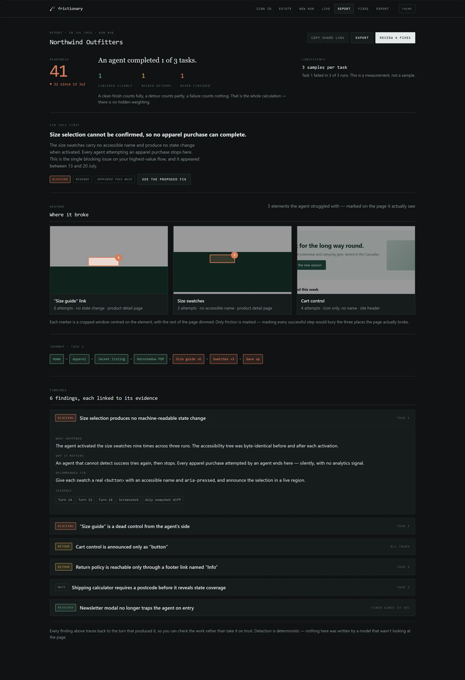
A clean finish counts fully, a detour counts partly, a failure counts nothing. That is the whole calculation — there is no hidden weighting. A generated headline, then three tallies, coloured only when non-zero so a zero stays grey and the eye lands on what actually happened.
The arithmetic is legible on purpose: an agency lead has to defend this number to a client, and a weighted composite they can't reconstruct is worthless to them however sophisticated it is.
The report looked complete and was not
Five rounds of iteration, and this was the most instructive. The first real report against a live site rendered a heatmap nobody could see, and the cause wasn't styling.
Screenshots were viewport-sized. Element bounding boxes can be anywhere in the document. On a long portfolio page the agent clicked a footer link at y = 6366 inside an 800-pixel-tall capture — so the marker was positioned at roughly 795% down the image, and drawn nowhere at all. Two of three markers were silently absent. The one that did render sat on a 20px icon, which at thumbnail scale is a speck.
Nothing errored. Nothing looked broken.
For a product whose entire pitch is evidence you can check, that is the worst available failure mode.
The fix had three parts, and only the first is engineering. Capture correctly: full-page screenshots recording document dimensions rather than viewport. Change what rendering means: a 6000-pixel page scaled to fit a column makes any real control invisible — technically correct, practically useless — so each marker now gets its own cropped window, centred on the element, with the surrounding page dimmed. Refuse to guess: runs recorded before the fix have unplaceable boxes, and those markers are dropped rather than drawn somewhere plausible.
A marker in roughly the right place is a lie with a confidence interval.
Why unplaceable markers get dropped
The other four rounds, and what each one was a consequence of
1 · Stop fabricating findings. Two bugs producing confident, well-written, wrong findings. Single-word labels like “Travel” were parsed as CSS selectors, timed out, and got reported as friction — on sites that worked fine. Then a worse one: a run against a domain that didn't resolve produced a finding advising the owner to fix their DNS. Nothing had been loaded, so there was no evidence behind that advice; the model was asked to explain a page it never saw and did what models do, which is answer fluently anyway.
That produced a taxonomy in the data model — STUCK, GAVE_UP, BUDGET_EXCEEDED, BLOCKED, FAILED. BLOCKED exists specifically so a site defending itself isn't scored as a design problem. Reachability moved ahead of the spend: nothing is charged if the site doesn't resolve.
2 · Navigation, and one section that was two. Help was a dead end. One nav component now appears everywhere. I merged “How it works” and “Example,” which turned out to be the same section twice — the third step is “you get this,” and immediately below it was the thing you get.
4 · Show the product, not a description of it. The landing page described three steps and showed one hand-built mock. It now alternates claim and proof three times. The mechanism is the real decision: the captures are generated by a script from an actual completed run, not drawn by hand — so the landing page cannot quietly drift into advertising something the product doesn't do. The hand-built preview was deleted for the same reason (−164 lines).
5 · Sell a recurring check, not a one-off report. Covered below.
A one-off report doesn't compound
The largest change, and strategic before it was visual. Three arguments moved me off the original buyer — solo founders and AI-native builders:
The original segment is the poorest one, with little budget, high churn, and a strong DIY instinct: the people most likely to rebuild this themselves rather than pay for it. A one-off report doesn't compound — every sale restarts from zero, which is a consulting business carrying software costs. And the technical moat is thin: the core loop is a browser driver and a prompt, reproducible in a weekend. What isn't reproducible in a weekend is a trusted standard, a history of runs to compare against, and distribution.
New pitch: “We tell you the day your site stops working for AI agents — and exactly what changed.” The evaluation is the capability; the recurring answer is the product.
That pivot moved who it's for. Select a segment to see the job it does for each, and the budget line it already fits into:
The estate view — the screen that makes the pivot legible. Fourteen client sites, scores, 30-day trends, and a regression alert at the top. A one-off report tool literally cannot have this page.
The part I'm proudest of
I labelled the pivot honestly, in the spec: “Status of this revision: a hypothesis, not a finding. Reasoned from market structure, with no customer contact behind it.”
Then rewrote the research question so it couldn't collect politeness — not “is this useful,” but “would you rather have this once, or every week, and what would you pay for either?” And wrote down, in advance, the three signals that would mean I was wrong: prospects want the report but not the cadence; agencies want to resell one-off audits rather than monitor an estate; or a second run against an unchanged site produces nothing anyone acts on.
The superseded positioning stayed in the spec, verbatim, in its own section — so that reversing the decision later would be a decision rather than an act of archaeology.
The comparison bug that would have killed a monitoring product
What got built was a comparison engine sorting findings across two runs into four columns, with the business logic named directly in the comments: fixed — present in the previous run, gone now, the good column; appeared — new since last time, the column that justifies the subscription; persisting — still there, not news but not nothing.
Testing it found the bug that mattered most. Comparison judged “unchanged” from the finding list alone — so a run whose score fell fifteen points with an identical list reported nothing changed. A real regression delivered as reassurance, which is the one failure a monitoring product cannot have.
A tool that claims it can fix everything isn't credible
Finding the friction is half the job. The other half is that the person reading the report often can't act on it alone — so the product proposes real patches: converting div swatches into named buttons, wrapping a size guide in a <dialog>, giving the cart control an accessible name. Select them, open a PR against a branch, and nothing touches production.
The detail I'd point at first is the row that can't be automated. One finding is marked “Not automatable — needs a product decision”: showing shipping coverage before asking for a postcode is a merchandising choice, not a markup defect. Guessing at it would be worse than leaving it.
Four of six findings have patches. The projection from 41 to 88 is labelled a projection, not a measurement — the same tasks get re-run against the staging branch to produce the real number.
The estate and export screens close the loop for the actual buyer: an agency needs to hand a client something with their own name on it, so the report exports white-labelled, with live accent-colour swatches that recolour the PDF preview as you pick them.
Export, white-labelled. The preview recolours live as you pick an accent, because an agency lead deciding whether this is client-ready shouldn't have to render a PDF to find out.
The heuristics underneath
This is the beginning of the actual intellectual property — a heuristic set for agent experience, in the way Nielsen's ten are for human interfaces. None of it was reasoned from first principles; each came out of watching a run fail.
No state change means repetition, not recovery
An action with no machine-readable state change causes an agent that cannot detect success to try again. And again.
Not in the accessibility tree means it doesn't exist
A control without a name in the tree is invisible to an agent, regardless of how obvious it looks to you.
Agents stop rather than guess
Any gate without a machine-readable path is a hard stop, not a slowdown.
Icons and position carry nothing
Meaning carried only by an icon or by placement is read literally or not at all.
Note how much of this overlaps with screen-reader accessibility. That overlap is a distribution strategy, not a coincidence — it's why compliance owners are a target segment: the accessibility tree is literally what the agent reads, so a site that fails for agents usually fails for screen readers too.
A run costs a cent, and that's a design decision
The cost of a run isn't an accounting detail on this product — it's the thing that decides whether the whole business model exists. A recurring check only works if running it is nearly free, and it's nearly free because of an architectural choice, not because the tasks are small.
The expensive part of most AI products is calling the model in a loop. Here the detection loop has no model in it at all: loops, give-ups, dead controls and budget overruns are found by deterministic code. A language model is called once per finding, only to write the explanation a human reads. Move the estate size and cadence below and watch the number hold:
Token management as a user-facing control
Cost isn't only the builder's problem; it's on the run form, where the user sets it. Turn budget caps how long an agent may work a task before the run is called — a BUDGET_EXCEEDED finding is itself a signal, because an agent that needs forty turns to find your returns policy has found friction. Samples per task is the direct lever on the non-determinism problem: run a task three times and you separate a one-off stumble from a control that reliably defeats the agent, trading a little cost for a lot of confidence. And the model picker — including “all three, compare” — puts the cost-versus-rigour choice where the person who pays for it can see it.
Pricing ships visibly disabled
The tiers are on the page — Snapshot, Practice, API — and every one of them is rendered and greyed out, with “coming soon” on it. That's deliberate. Selling a tier I couldn't yet deliver would have bought signups at the cost of the only thing a pre-revenue product has, which is that nobody has been misled by it yet. Showing the shape of the pricing without taking money for it is more honest than hiding it, and more honest than charging for it.
The structure follows the pivot: the free tier is the one-off snapshot that gets someone in the door, and the paid tiers are the recurring ones — scheduled re-runs, regression alerts, before/after comparison. The thing worth paying for is the cadence, so that's the thing behind the paywall.
What's measured, and what isn't
The engine works and is invite-only. Two figures are real and measured — the ones the section above is built on:
Cost per run$0.0115against a target of under $1
·
Runtime, 2-flow case8.4sagainst a target of under ten minutes
What I don't have is user research. No usability study has run, and no discovery conversation has happened — the pivot is reasoned from market structure and labelled as a hypothesis, with its disproving conditions written down before any data. I'd rather show you the pre-registered kill signals than a table of numbers I can't defend.
What's still open
Non-determinism is the real risk, and it's recorded as one. Re-running the same three tasks against the same unchanged site produced different outcomes: “find contact info” was STUCK in run one and COMPLETED in run two. “What industries” was the reverse.
The agent is non-deterministic, so a single run is a sample rather than a measurement.
The open problem, with a hard gate attached
This cuts three ways: a one-off report can simply be wrong; comparison becomes ambiguous, because a change is supposed to mean the site changed; and it both supports the recurring pitch (more samples) and complicates it (which change was real?). It's explicitly unresolved, and gated — this gets decided before any report goes to a paying customer.
So confidence becomes something the reader sees
The design answer isn't to pretend a run is deterministic — it's to show the reader how far to trust each finding. Because samples-per-task re-runs a task several times, a finding carries a reproduction signal: a control that defeated the agent in 3 of 3 samples is stated plainly, while one that failed in 1 of 3 is surfaced as unstable — flagged, not asserted. The person calibrates their own trust from that, which is exactly right for a probabilistic tool. It's the same rule I hold the security work to: legible confidence earns trust; a confidence number that hides what it's unsure of spends it.
What's still missing is the loop back — a lightweight was this a real problem? on each finding that feeds the confidence signal over time, so the tool learns which patterns it calls wrong. Named in the backlog, not built, and I'd rather show the gap than a captured-feedback number I don't have yet.
The product surface hasn't caught up to the strategy. The comparison engine is a tested library with zero call sites. The north-star screens above are built as a working clickable prototype; the pilot app is still single-site with no estate view and no scheduling. That gap is named in the backlog rather than hidden. Also not built: hosting, magic-link auth, PDF export, a second model provider, payments.
How it was actually built — the repo, the running product, and an AI pair in the same window. Six weeks and counting, working alone.
What this demonstrates
Designing for a user who isn't human. Every established UX method assumes an observable human. I had to build the observation layer before I could do any research at all — then decide what “usability” even means when the user is a language model reading an accessibility tree.
Knowing which failures are the dangerous ones. The heatmap bug and the comparison bug were the same failure in two places: a system reporting confidently on something it hadn't actually established. For a product whose value proposition is checkable evidence, that's the only class of bug that can kill it — and both were caught by testing against real sites rather than fixtures.
Typography and colour as semantics. Two typefaces because there are two voices. Two colours because there are two states worth interrupting for. One animation because motion means one specific thing. Nothing in the system is decorative, and I can say what every element is for.
Falsifiable strategy. The pivot is labelled a hypothesis, the research question is written to resist politeness, and the conditions that would disprove it were written down before the data came in.
Design engineering, end to end. Spec, positioning, information architecture, visual system, copy, and the working implementation — including the browser automation, the data model, and the deterministic detection layer that makes the evidence claim true rather than aspirational.
Decisions defended in writing, at the moment of the decision
Permanent share links, because a dead link in a pitch is worse than a stale one — with the expiry field kept in the schema so it can be switched on per-report later without a migration. Idempotent sharing, because two live URLs for one report is a way to lose track of what was sent to whom. One component for the owner's view and the public view, so the two cannot drift.
Dropping unplaceable markers. Marking only friction, because marking successful steps too would bury the two or three places a page actually broke. Trusting the human over the model on their own business. Keeping the superseded positioning on the record.
Each is a trade-off with a written reason attached, so a future reversal is a decision rather than a rediscovery.
Find out before your customers' agents do.
Agent
Live modelPowered by GPT-4o
Grounded in Sayena's case studies, not a canned bot. Billed per question — so make them good ones.